Picking out magazine colors
In a survey I made and sent out to my family and friends, almost half of all voters choose pink, white and black as their favorite color scheme for the beauty magazine. I personally like these colors together and think they would be perfect for my project. Pink is a very different color than black and white because it can be elaborate and have so many different shades and tones. I can apply pink makeup or accessories on myself and my other model to show our feminine and girly side. I will also be shooting my pictures at the beach so my models will be wearing shades of white clothing which will look very sleek and classy up against the pink masthead and blue sky.
I could make the masthead a dark, light or even hot pink; especially if I am to take the model photos at the beach, this could really make them pop against the blue sea and sand background.

Example of the dark pink I could use in my magazine. This color can be used for the text or font and designs on the pages.

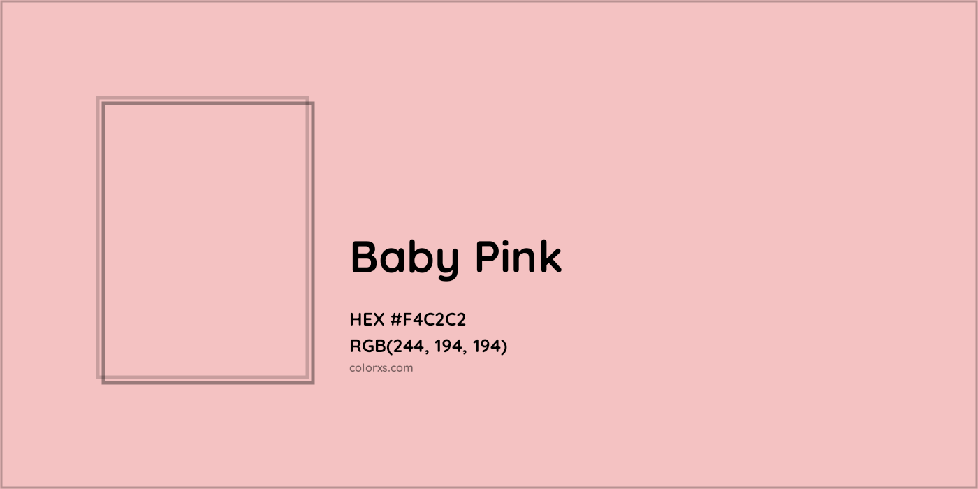
A good example of a baby pink color I could use for my magazine. This color could be incorporated into some of the makeup photos, whether it be the actual product or the makeup on skin.

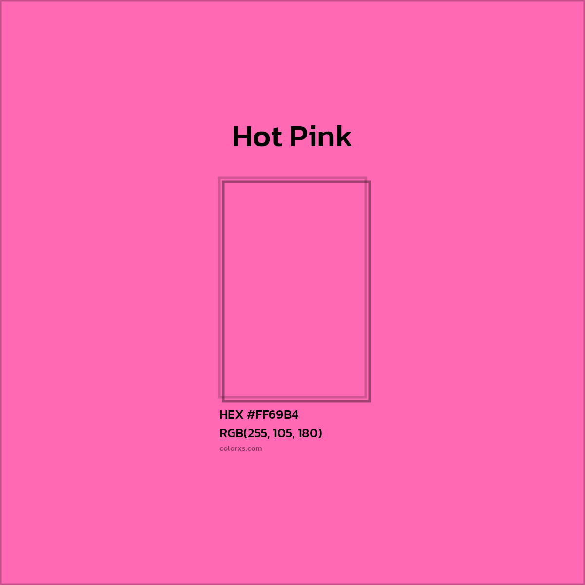
This is a very feminine hot pink color I could incorporate in my magazine. This color could be used for the subheadings in my magazine because it will stand out against the white and blue (from ocean) background.

I will use the color white for the cover lines of the magazine cover and double page spread. This example above from Harper's Bazaar shows how magazine designers will use the white font on top of darker backgrounds. The color white represents peace, innocence and purity. Which are all things women look for in the media or are attracted to.
Work Cited:
- https://www.colorcombos.com/colors/990066
- https://www.colorxs.com/color/baby-pink
- https://www.colorxs.com/color/hot-pink
- https://www.dailymail.co.uk/news/article-7643717/Harpers-Bazzar-slammed-magazine-cover-depicting-skinny-white-girls.html


No comments:
Post a Comment