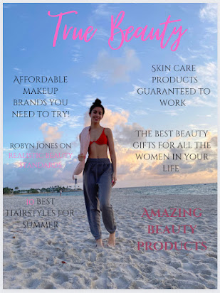
My magazine layout and sketches
A sketch of my cover page. My masthead (True Beauty) will be placed at the top with the cover image of my model in the middle of the page. The main heading, in bold font will be at the bottom left and the bar code at the far bottom right side of the page. The cover lines on makeup products and skin and hair will be placed throughout the page around the cover image.
My table of contents sketch shows that the page will be split into two. One side will have pictures of different beauty products and my model pictures while the other side of the page will have headlines with the according page number. The headings will be a different color than the headlines and page numbers.
My double page spread sketch will also be split into two sections. The left side will have a close up image of my model's face wearing pink makeup and then a description next to it of the products used. Under that will be a celebrity interview talking about beauty standards with a model image next to it. On the right side of the page will be affordable makeup products, skin care products and cute hair styles for readers to try out. These will include pictures and a description.
This is the Great Vibes font I was originally going to use for the masthead of my magazine. The letters flow nicely together and it looks very girly. I decided to not use this because I want a font a little more simple for my cover.
This is the new font I am using for the masthead of my magazine. This font is called Salty Malthy and is more simple than the Great Vibes font. I will be using this font for my magazine because it is more simple and won't take away from the pictures and cover lines I will have on my cover page. I sketched it in pink because that is the color I will edit my masthead to be.
- https://www.dafont.com/salty-malthy.font?text=True+Beauty


No comments:
Post a Comment