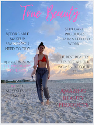
Beauty magazine shots
In this step of my magazine process, I went to my local beach during sunrise and took some shots of my makeup product in the sand. I played with different angles and filters and of VSCo, a editing app on my iPhone.
This picture shows the makeup products in the sand, the ocean in the background and the colors of the sunrise. These are all things I wanted to include in my shots. The products in the sand are from Maybelline, a drugstore and affordable brand I wanted to incorporate into my magazine.
I played around with taking the photos at this wide angle and long shots too. I used my iPhone to take this picture and used the Portrait mode to make that blurry background effect. This helps readers easily focus on what the products are. The sunrise is still visible in this shot as well.
This long shot shows the products in a larger point of view than the wide shot above. The sand and sky is more visible in this photo, with the products being placed in the center. You are able to clearly see the brand (E.L.F.) and what the products are. I tried to use makeup with pink, white and black color on it to match my color scheme of the magazine
This shot was taken in the sand with no ocean in the background. I like this picture because the reader is instantly drawn into the products because there is no background distractions. Because the picture itself doesn't have that good of quality, I felt I needed to give it a pink tone (shown below). These are all my own E.L.F. makeup products that I want to incorporate into my magazine.
This is the same shot as the one above but I edited it to make the sand and makeup products a little more pink toned. After editing, the picture looks more "alive" and goes better with the pink color scheme of the magazine. The sand looks brighter, as well as the white in the products. I used the app VSCO on my iPhone to edit this picture, and will continue to use this software throughout my magazine process.


No comments:
Post a Comment