Monday, February 28, 2022

Test Shots/practicing shots

                                       Beauty magazine shots 


In this step of my magazine process, I went to my local beach during sunrise and took some shots of my makeup product in the sand. I played with different angles and filters and of VSCo, a editing app on my iPhone.


This picture shows the makeup products in the sand, the ocean in the background and the colors of the sunrise. These are all things I wanted to include in my shots. The products in the sand are from Maybelline, a drugstore and affordable brand I wanted to incorporate into my magazine. 


I played around with taking the photos at this wide angle and long shots too. I used my iPhone to take this picture and used the Portrait mode to make that blurry background effect. This helps readers easily focus on what the products are. The sunrise is still visible in this shot as well. 


This long shot shows the products in a larger point of view than the wide shot above. The sand and sky is more visible in this photo, with the products being placed in the center. You are able to clearly see the brand (E.L.F.) and what the products are. I tried to use makeup with pink, white and black color on it to match my color scheme of the magazine 


This shot was taken in the sand with no ocean in the background. I like this picture because the reader is instantly drawn into the products because there is no background distractions. Because the picture itself doesn't have that good of quality, I felt I needed to give it a pink tone (shown below). These are all my own E.L.F. makeup products that I want to incorporate into my magazine. 


 This is the same shot as the one above but I edited it to make the sand and makeup products a little more pink toned. After editing, the picture looks more "alive" and goes better with the pink color scheme of the magazine. The sand looks brighter, as well as the white in the products. I used the app VSCO on my iPhone to edit this picture, and will continue to use this software throughout my magazine process. 


Friday, February 25, 2022

Magazine Timeline

                             Making a timeline for my magazine process


I made two calendars to help me stay on track with my magazine and ensure I complete it on time.


This calendar for February shows that I will be doing my blog posts for most of the last week and over the weekend I will go to the beach and take my model and product pictures during the sunrise. I will also edit the picture I have taken. 

This March calendar goes from the beginning of the month until my final magazine is due after spring break on March 28th. This month I will be completing many blog posts, my interview for the double page spread and taking/ editing more pictures. I will also start putting my magazine together and create my cover and contents page. 


Thursday, February 24, 2022

Layout and sketches

        My magazine layout and sketches


A sketch of my cover page. My masthead (True Beauty) will be placed at the top with the cover image of my model in the middle of the page. The main heading, in bold font will be at the bottom left and the bar code at the far bottom right side of the page. The cover lines on makeup products and skin and hair will be placed throughout the page around the cover image. 


My table of contents sketch shows that the page will be split into two. One side will have pictures of different beauty products and my model pictures while the other side of the page will have headlines with the according page number. The headings will be a different color than the headlines and page numbers. 
 

My double page spread sketch will also be split into two sections. The left side will have a close up image of my model's face wearing pink makeup and then a description next to it of the products used. Under that will be a celebrity interview talking about beauty standards with a model image next to it. On the right side of the page will be affordable makeup products, skin care products and cute hair styles for readers to try out. These will include pictures and a description. 


This is the Great Vibes font I was originally going to use for the masthead of my magazine. The letters flow nicely together and it looks very girly. I decided to not use this because I want a font a little more simple for my cover.

This is the new font I am using for the masthead of my magazine. This font is called Salty Malthy and is more simple than the Great Vibes font. I will be using this font for my magazine because it is more simple and won't take away from the pictures and cover lines I will have on my cover page.  I sketched it in pink because that is the color I will edit my masthead to be. 

- https://www.dafont.com/salty-malthy.font?text=True+Beauty

Tuesday, February 22, 2022

Costumes/props/mis-en-scene

Mis-en-scene included in beauty magazines


Women are what's normally shown in beauty magazines. They are shown as beautiful and flawless to the readers. Societies beauty conceptions depict that standard women have to be skinny, tall, curvy, and have perfect skin to be what's considered "beautiful". In my magazine, I will demonstrate the real meaning of beauty. I will interview a famous celebrity and ask them about beauty standards and if they agree with them. I can also include uplifting quotes on the cover of my magazine to make readers interested and maybe even make them smile.

Beauty products are also shown inside beauty magazines. Products like makeup, skin and hair care, fragrances, hair appliances and nail products are included in these magazines. In my magazine, I will include pictures of drugstore makeup products like E.L.F. and L'Oréal Paris. These products are affordable but still good quality which will attract people to read my magazine.


Here is a long shot of me at the beach. I need to go back to the beach and take more pictures earlier during the sunrise when the sky is pink. I can use a picture like this for my cover image.


Model's Mis-en-scene: The model for my magazine will have very subtle makeup. Some light mascara, eyeliner, highlighter and lipgloss will be the most suitable makeup for my model. They will have on jewelry like silver necklaces, silver hoops earrings and rings on their hands. My models hair will either be pulled back into a hair clip or will be down and flowing with the wind at the beach. The outfit the model will be wearing will either be pink or black.


This is a picture of my location for my magazine. It is the sunrise at the beach. As you can see there are pink colors in the sky which will match my pink, white and black theme.


This is a product picture I took at the beach during the sunrise. Since this sunrise didn't have many pink colors, I can edit the picture with some pink filters. These are E.L.F. products from the drugstore that I will include in my magazine.


Tuesday, February 15, 2022

Magazine lighting

                                  Different lighting ideas for my magazine


My magazine pictures will be taken outside (at the beach), so the main source of lighting will be the sun. The light will be natural and not artificial. Hard light, like from the sun, will emphasize the features and shadows in my pictures. I do plan to take some pictures of the models during the sunrise so there will not be direct sunlight at this time but instead beautiful pink clouds with the sky/ ocean in the background. Because I am taking the pictures outside with natural light, I will have to think about cloud coverage for that certain day and how that will effect shadows and certain features. 


Beach Bound? Beware of Sun & Wind Burns | Superpages

The picture above shows one of the examples of light I will use for my magazine. I will be going to the beach and using natural sunlight for my model pictures. This will create hard light and will occur when this sun is shinning directly on top of the models. 


This is a picture I took of the sunrise at the beach. The sky is light pink which will match with my pink masthead and the other colors I am including in my magazine. Because it is still light outside but there is no direct sun out yet, taking the pictures during sunrise will create soft or diffused light. Soft light will smooth out the models features and not emphasize on the little details of the pictures. 


Sunscreen Product Photography | Cosmetics photography, Beauty products  photography, Photography portfolio

I could place my beauty products in the sand and take the pictures with the ocean in the background. My IPhone has portrait mode included which will make this blurry background and focused picture effect on my photos.


Cosmetics & Makeup | Still Life Product Photography | London

I can also take my beauty product model pictures on the sand at the beach. I could also bring towels that are the same colors or will match with my products. The sand at the beach is a neutral tan color and won't take away from the products or distract the reader.


Work Cited

-   https://www.format.com/magazine/resources/photography/lighting-in-photography
-   https://www.superpages.com/em/beach-bound-beware-sun-wind-burns/
-   https://www.howlettphoto.com/cosmetics


Wednesday, February 9, 2022

Magazine color

                                              Picking out magazine colors


In a survey I made and sent out to my family and friends, almost half of all voters choose pink, white and black as their favorite color scheme for the beauty magazine. I personally like these colors together and think they would be perfect for my project. Pink is a very different color than black and white because it can be elaborate and have so many different shades and tones. I can apply pink makeup or accessories on myself and my other model to show our feminine and girly side. I will also be shooting my pictures at the beach so my models will be wearing shades of white clothing which will look very sleek and classy up against the pink masthead and blue sky.


I could make the masthead a dark, light or even hot pink; especially if I am to take the model photos at the beach, this could really make them pop against the blue sea and sand background.  


990066 Hex Color | RGB: 153, 0, 102 | DEEP PINK, FRESH EGGPLANT, FUCHSIA,  FUSCHIA, HOT PINK, MAGENTA

Example of the dark pink I could use in my magazine. This color can be used for the text or font and designs on the pages. 
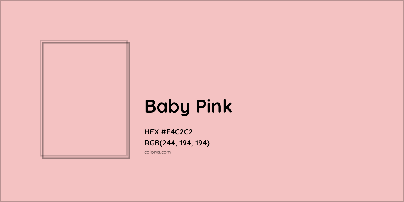

Baby Pink Color Code (Hex RGB CMYK), Paint, Palette, Image - colorxs.com

A good example of a baby pink color I could use for my magazine. This color could be incorporated into some of the makeup photos, whether it be the actual product or the makeup on skin.
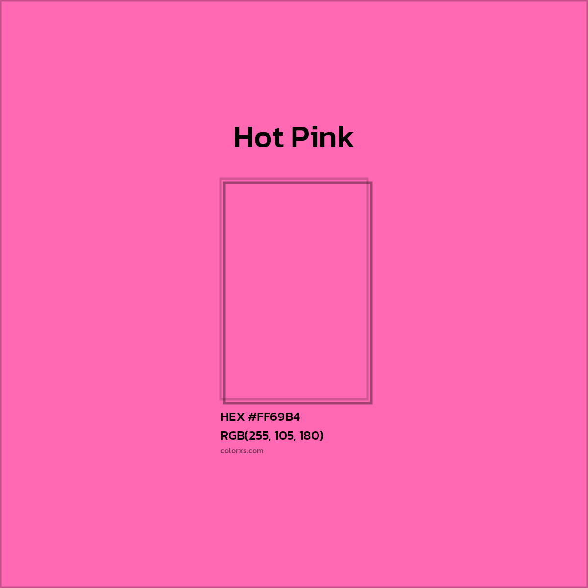

Hot Pink Color Code (Hex RGB CMYK), Paint, Palette, Image - colorxs.com

This is a very feminine hot pink color I could incorporate in my magazine. This color could be used for the subheadings in my magazine because it will stand out against the white and blue (from ocean) background. 


Harper's Bazzar is slammed for magazine cover depicting 'skinny white  girls' | Daily Mail Online

I will use the color white for the cover lines of the magazine cover and double page spread. This example above from Harper's Bazaar shows how magazine designers will use the white font on top of darker backgrounds. The color white represents peace, innocence and purity. Which are all things women look for in the media or are attracted to. 


Work Cited:

- https://www.colorcombos.com/colors/990066

- https://www.colorxs.com/color/baby-pink

- https://www.colorxs.com/color/hot-pink

- https://www.dailymail.co.uk/news/article-7643717/Harpers-Bazzar-slammed-magazine-cover-depicting-skinny-white-girls.html


Magazine masthead

                                     Creating the beauty magazine masthead


My magazine will be named "True Beauty". I chose this title because it got almost half of the votes in my survey, where I gave people 4 title options and they had to pick which one they'd rather see. This title represents someones true or inner beauty and not just what's on the outside. It will fit very well with my beauty magazine.


Famous magazine masthead examples: 
new-beauty-logo | GG Benitez

New Beauty magazine logo/ masthead

This logo is very simple and the font being used makes all the letters the same size. I won't be using this masthead for inspiration for my magazine because I want a font that looks more feminine.
Harper's Bazaar Logo | evolution history and meaning

Harper's Bazaar magazine logo/ masthead

This logo is black in color and the font gives off a very editorial and luxurious feel. I like this font because of the thick and thin outline of the letters.

Allure Logo Vector (.EPS) Free Download

Allure magazine logo/ masthead

The allure logo is shown with all chunky, lowercase letters. This font won't be used for my magazine because it looks masculine and I want letters that will flow together.

Vogue Logo | evolution history and meaning

Vogue magazine logo/ masthead

The Vogue magazine logo font comes off as fancy and elegant. It is a modified version of the font Didot.


My magazine masthead: 

Great Vibes Font Free - Dafont Free

Great Vibes font

The font that I will be using for my masthead is called Great Vibes. The masthead will say "True Beauty". This font also got almost half of the total votes on my survey. It makes the words flows very elegantly together and have great, big uppercase letters. Using this font for my masthead will create a feminine feel. The color scheme for my magazine will be pink, white and black.  I am thinking of making the masthead a pink color, but I'm not sure yet if it will be light, dark or hot pink. These colors will pop out on the beach background where I am having my photoshoots and taking pictures. 


Work Cited:

- https://ggbenitezpr.com/media_placement/newbeauty/new-beauty-logo/

- https://1000logos.net/harpers-bazaar-logo/

- https://seeklogo.com/vector-logo/210379/allure

- https://1000logos.net/vogue-logo/

- https://www.dafontfree.io/great-vibes-font-free/


Sunday, February 6, 2022

Models in beauty magazines

                            Beauty magazine model choices


Most seen magazine models:

Zendaya Allure January 2017 | POPSUGAR Beauty

Zendaya modeling for the cover of Allure magazine.


Flawless! Khloe Kardashian On The Cover Of New Beauty Magazine -  OnoBello.com

Khloé Kardashian modeling for the cover of New Beauty magazine.


Models in beauty magazines will most likely be famous celebrities. They have smooth and perfect skin and hair. The models can either be wearing an outfit that stands out on the background or one that matches the magazine colors. In the above cover image of Zendaya, she is wearing a silky yellow dress that pops against the bright blue background and the red masthead. In the second image, Khloé is wearing a simple white shirt that is the same color as the masthead and cover lines. 


My magazine models:


Model #1: Sarah Budnick

Magazine page: Cover and double page spread

Gender: Female 

Age: 18

Height: 5'6


Model #2: Robyn Jones

Magazine page: Table of contents and double page spread 

Gender: Female

Age: 17

Height: 5'8


The Best L'Oreal Makeup - Beauty With Lily

Model #3: Makeup products 

Brands: L'Oréal Paris, e.l.f., Maybelline

Magazine page: Contents page and double page spread


Shampoo, Conditioner, Hair Products, Body Wash & More | OGX®


The Best Skin Care Brands - The 30+ Skincare Brands We Love


Model #4: Hair products/ skin care 

Brands: Dove, ogx, Shea Moisture

Magazine page: Contents page and double page spread


Magazine survey


Magazine survey and results 


Almost half of the individuals that voted on my survey wanted the title to be "True Beauty". True beauty is a good title and I will be using it in my magazine. True beauty is represented by a woman's inner self; their personality and character within. One person who voted also added a title called "All of US".


The title font that got the most votes was Great Vibes. This is a very fancy and sophisticated font while also being feminine because of the flowing connected characters. Great Vibes will be the font I will use for my title, considering it was my top choice as well. The other fonts could be used for the headings or cover lines included in my magazine. A picture of the font is shown below. 


I allowed this question to have multiple choices. The voters chose that the cover image should include a close up shot of a females makeup. They also chose that the cover should include colorful headings instead of simple headings. I agree will both these responses and will be using them in my magazine.  


The color scheme pink, white and black won by a tremendous amount. Considering this is a beauty magazine, I can see why these colors won. Black is a very sophisticated and intense color while the white helps to offset this and bring in a sense of calmness and purity. The color pink is perfect for a beauty magazine because it represents femininity and softness. All these colors will be incorporated into the cover page and throughout my magazine. 


This question asked where the location should be for the different photos included in the magazine. This was one of the only responses I didn't agree with. Since my color scheme will include pink, white and black, I think taking the photos at the beach will be better for the magazine. I can take the pictures on the sand or with the ocean in the background. A park in nature was a good choice but then I'd have to include trees and grass in the pictures and that wouldn't necessarily blend well with the colors.


For this survey question I asked what products people would want to see in the magazine. Skin care products got the most votes and then makeup products. Considering I am creating a beauty magazine, I will be using the products that we're most voted on. I also might include some hair product examples in the magazine because the cover will talk about hair in its cover lines.


Affordable makeup products and brands won up to half of the votes. This is a topic I am for sure going to be including in my magazine. The word "affordable" doesn't always mean cheap or bad quality, but instead it grabs peoples attention and makes them want to buy a product. The best skin care products got the next most amount of votes and will be good to include in my magazine in the section with skin care products (as seen above).


The best makeup brand that people want to see in the magazine is L'Oréal Paris. I personally love this brand and use their products often. This will be good for when I have to take pictures of these products for my magazine. NYX is the next product that won the most votes but I will be using the brand e.l.f. instead to advertise in my magazine. 


Beauty Magazine

                                                              Beauty Magazine   My beauty magazine, True Beauty is complete! I used the gra...