Monday, March 28, 2022

Beauty Magazine

                                                             Beauty Magazine  


My beauty magazine, True Beauty is complete!

I used the graphic design platform Canva to create my finished magazine because it is easy to navigate and helped me add pictures and change the color and font for my magazine.   


Here is the link to view the beauty magazine :

- https://www.canva.com/design/DAE7SHTq6QU/PJ5BMC1xRxDeHuELKeLAhA/view?utm_content=DAE7SHTq6QU&utm_campaign=designshare&utm_medium=link2&utm_source=sharebutton

Update page


The time has come!!!

My final magazine is complete but I wanted to share some last minute changes I had throughout the past few days.


So here's a little update on my final editing process. 


So first off, I made some changes with the font and ended up using Cinzel Decorative for the titles of the table of contents and double page spread because it gave the magazine a sleek and classy look. I stayed with my plan of making all of the headings a bright pink color and used Cinzel Decorative font again. The page numbers and small headings are in a darker pink color and have bold letters to add sophistication to the pages. This makes them pop out and grab the readers attention. I incorporated the color pink into my photography as well to match the theme, for example the sky, my nail polish, and my own makeup products. 

In the cover page, I gave the masthead a flowy font to still make the magazine have a fun and lighthearted feel. Both bright and dark pink colors were incorporated into the headlines of the cover page.

My interview with Robyn Jones was about beauty standards in today society and what she's doing to change them. I also added pictures of her to go with the theme of the beauty magazine.

Tuesday, March 22, 2022

CCR 4

      Creative Critical Reflection 4


For my third creative critical reflection I answered the question "How did you integrate technologies - software, hardware and online - in this project?" I created a infographic using the website Venngage. This allowed me to describe the different technologies I utilized when putting my beauty magazine together. I introduced some platforms including VSCO, which I used to edit my pictures as well as Google Blogger which allowed me to create my blog posts. 


CCR 3

                              Creative Critical Reflection 3


For my third creative critical reflection question I answered the question, "How did your production skills develop throughout this project?" I made a presentation on Slides to answer this question. In my opinion, my skills improved in Google Blogger and Canva. My skills also developed because of others examples. 


You can find the link to my Slides presentation here:  https://slides.com/sarahbudnick/deck

Thursday, March 17, 2022

CCR 2

  Creative Critical Reflection 2


For my second CCR, I created a cartoon which answered the second question, how does your product engage with audiences and how would it be distributed as a real media text? I used the software app Pixton which allows you to create digital cartoons.


 I made the background of the cartoon at the beach/ ocean to match the theme of my magazine. The cartoon shows two unfamiliar girls meeting and then getting into a conversation about the new beauty magazine, "True Beauty". I used this to describe what will be shown inside the magazine and the special features it includes. 


Monday, March 14, 2022

Focus group (feedback)

                                      Magazine feedback 


This week, I have to share my beauty magazine with 4 people and get their opinions and feedback on my product. I asked them what they liked about the magazine and if there is anything they think I should change in it.


The first person I shared my magazine with was my mom. She really liked the name "True Beauty" and said it was very fitting for this type of magazine. My mom also thought the pink masthead and cover lines against the beach background looked very chic. She said that the typography and layout of the table of contents and double page spread looked sophisticated and classy.

My friend Robyn enjoyed the makeup product pictures and how they were edited. She also liked how she got to be featured inside the magazine as a famous celebrity. She suggested that I should take more product pictures for the magazine, maybe even in the water at the beach. Robyn also had an idea that I should take pictures of certain hairstyles or makeup looks to include into the magazine.

I also showed my friend Jose my beauty magazine. Since he is a guy, he wasn't that interested in the makeup and beauty side but instead the photography and the classy look caught his attention. He also agreed with Robyn that I should take some pictures in the ocean to incorporate some blue colors into the magazine. This will lessen the feminine feel and add a more masculine or modern look. I agree with this too.

The last person I shared my magazine with was my friend Shira. She spoke very highly of it and enjoyed all the creative headings included in the table of contents. She also pointed out how professional my makeup product pictures look, which I just used the portrait mode on my iPhone camera.


CCR 1

                             Creative Critical Reflection 1


This is my CCR, question 1, how does your product use or challenge conventions and how does it represent social groups or issues? I created a pamphlet using the graphic design website Canva which allowed me to easily answer the question and add pictures as well as information. I described beauty standards today and how women are constantly going against them. I want my magazine to inspire women to be their true selves. I was also able to talk about my magazine interview and what I might ask.


You can also access my Canva CCR through this link: 

https://www.canva.com/design/DAE66_S2Fg4/sx0rM5sa1HK85EwaYgAEsw/view?utm_content=DAE66_S2Fg4&utm_campaign=designshare&utm_medium=link2&utm_source=sharebutton

Sunday, March 13, 2022

Developing content

                            Double page spread rough draft


Since my final magazine is due in a couple of days, I created a digital rough draft of my double page spread to keep me organized. I also made a rough draft like this for my table of contents page.


The line going down the middle represents the two pages. The left side page will include a heading, a picture of a model wearing makeup with description and a celebrity interview. I will be interviewing pop star Robyn Jones on beauty standards. The right page will include different beauty categories, for example, affordable makeup products, skin care and hairstyles to try. Each category title will be pink in color and include a description and pictures of the products as well as demonstration pictures.


I will use the same Sweet Grand font for my titles and headings here that I used for my table of contents page. The rest of the wording will be in the font Times New Roman. Using the same fonts throughout my magazine will make it look uniform and reduce distractions for the readers. 

My interview will be about beauty standards and I will ask Robyn how she thinks these standards are changing and evolving today. I will also ask her about how her new makeup brand, Enchantress beauty is helping women conquer these beauty standards and feel more comfortable in their bodies. 


Magazine content

                                                  Table of contents rough draft


There is only a few days left until my final magazine is due. 


Today, I created a rough draft for my table of contents page. It looks exactly like my hand made sketch I made a few blog posts ago just this one is digital. The title will say "Contents" with the certain volume and issue numbers above.

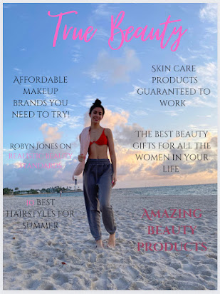
This rough draft will help me stay organized when creating my final table of contents page with the pictures, fonts and colors all included. The page itself will be white and the headings as well as page numbers will be pink in color. All the other wording (headlines) will be black. The masthead of my magazine (True Beauty) will be placed under the contents title. 


I will add my beauty product and model pictures into the boxes on the left hand side of the page and the actual contents will go on the right side. Each of my headings will be split into makeup, hair and other beauty/ fashion categories. There will be headlines that coordinate to each of the headings, with the specific page number above. This will help readers easily find certain topics they are interested in seeing inside the magazine. 


The headings will be in a different font than the title and headlines. For my headlines, I will use a generic and simple font like Times New Roman to minimize distractions and crowding on the page. The brief categories for the headlines are shown below.


 My headings font is shown above and is called Sweet Grand. It gives off a contemporary and feminine feel. Giving the headings a creative font will attract readers to them.

- https://www.dafont.com/sweetgrend.font?text=Best+makeup+products&back=new


Thursday, March 10, 2022

Table of contents

                                Developing the table of contents page


   I am now starting to put together my table of contents page for my magazine. The table of contents page in a magazine is crucial to its success and how readers will interpret the magazine. The page will help the reader navigate inside the magazine and let them know what every page will describe and what will be included on it. It should have a simple but eye-catching design with clear information. 

   Since I am making a beauty magazine, I will include topics that relate with makeup, skin care, hair care and fashion. Mostly all of my product and model pictures will be taken at the beach, hopefully during sunrise. I will have this pages title say "table of contents" or just "contents" in bold pink font instead of the name of the magazine like the example shown below.

   You can get creative with designing the page, which is why I will include a bright color pink title and headings with black descriptions of the page underneath. The black wording on a white background with pink accents will make the page look very classy and sleek. I will also add different fonts and sizes to my page to attract the reader and make them want to read more.


18 AVT313: Tables of Contents ideas | magazine design, magazine layout,  magazine layout design


Above is a table of contents example from ELLE beauty magazine that I want to resemble in my magazine. I will place my product and model pictures around the headings. Except my headings will be pink in color and not red. My page numbers will be in black, bold font. I will make my headings about the best skin care products, affordable makeup brands/ products, cute hairstyles to try and the best outfits to wear for summer.


Tuesday, March 8, 2022

Double page spread interviews

                                    Magazine Interviews 


  I will now start to put together my double page spread for my magazine. In it, I will be conducting an interview with the upcoming celebrity Robyn Jones. Robyn is a famous singer and actor and a lot of women look up to her and resonate with her. I will be asking her questions on beauty standards today and how she feels about them. I will mention and ask questions on the importance of taking care of ones health and well being.

  In multiple interviews already Robyn talks about her new makeup brand, Enchantress beauty. She describes how she wants the brand to make individuals feel more comfortable with themselves and feel less alone. Robyn also emphasizes in her brand website that she wants everyone to stop comparing themselves to each other and embrace their true selves. She mentions mental health and how she overcame many struggles with it in her life. 


  Typical magazine interviews will ask deep questions to create an interesting conversation. Each question should have an elaborate answer and interest the reader. My questions will be about beauty standards. One thing I could ask would be "How do you think your makeup brand is changing beauty standards today." As well as, "If you could change one thing about todays beauty standards, what would it be?"


GinoBaileau.com - Reflection Magazine Interview

This magazine interview example is something I would like to resemble in my magazine. The title is easily seen because of the bright red color and each question is in bolder font than the answers. Everything is simply laid out and is easy to read. I will be making my titles pink in color to match my color scheme. There is also a picture of the model above the interview questions in this example which I also want to include in my magazine


- https://ginobaileau.format.com/14657-reflection-magazine-interview


Beauty Magazine

                                                              Beauty Magazine   My beauty magazine, True Beauty is complete! I used the gra...